I was selected as a semifinalist in a juried competition to redesign the official logo for the Town of Pineville, North Carolina. Throughout the project, I collaborated with town officials to translate the community’s identity, values, and history into a cohesive visual system. My design process was grounded in research, including an exploration of Pineville’s cultural context, historical background, and existing visual landscape to inform key design decisions. I developed and presented multiple logo concepts, refining each direction through iterative feedback from stakeholders. The final deliverables included a complete logo package with primary and secondary marks, typographic guidelines, and signage mockups to demonstrate how the identity would function in real-world applications.
Objective:
Redesign the Pineville, NC logo to make it more progressive, while also adhering to the traditional core values of the town. This logo will aim to bring in new people while also appealing to the established residents
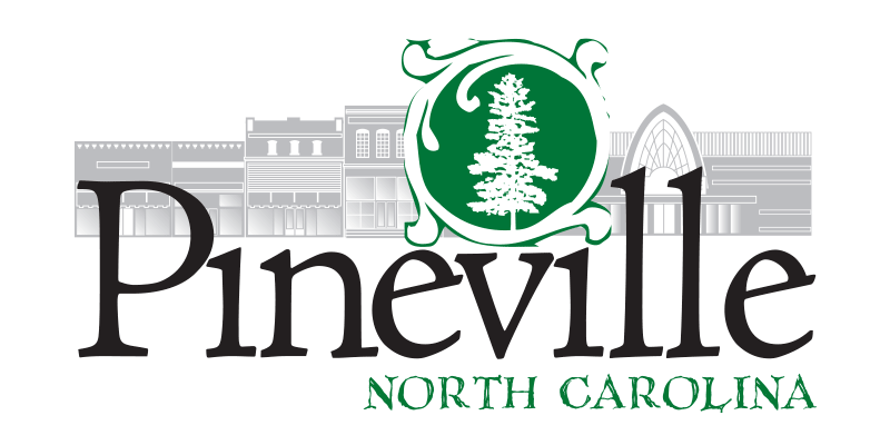
Old Logo
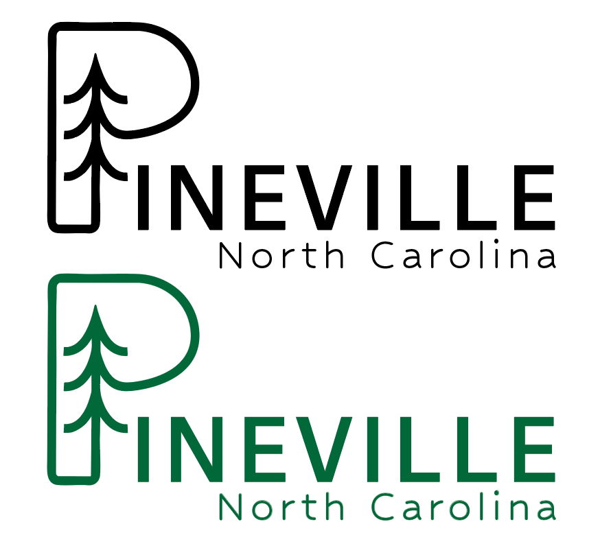
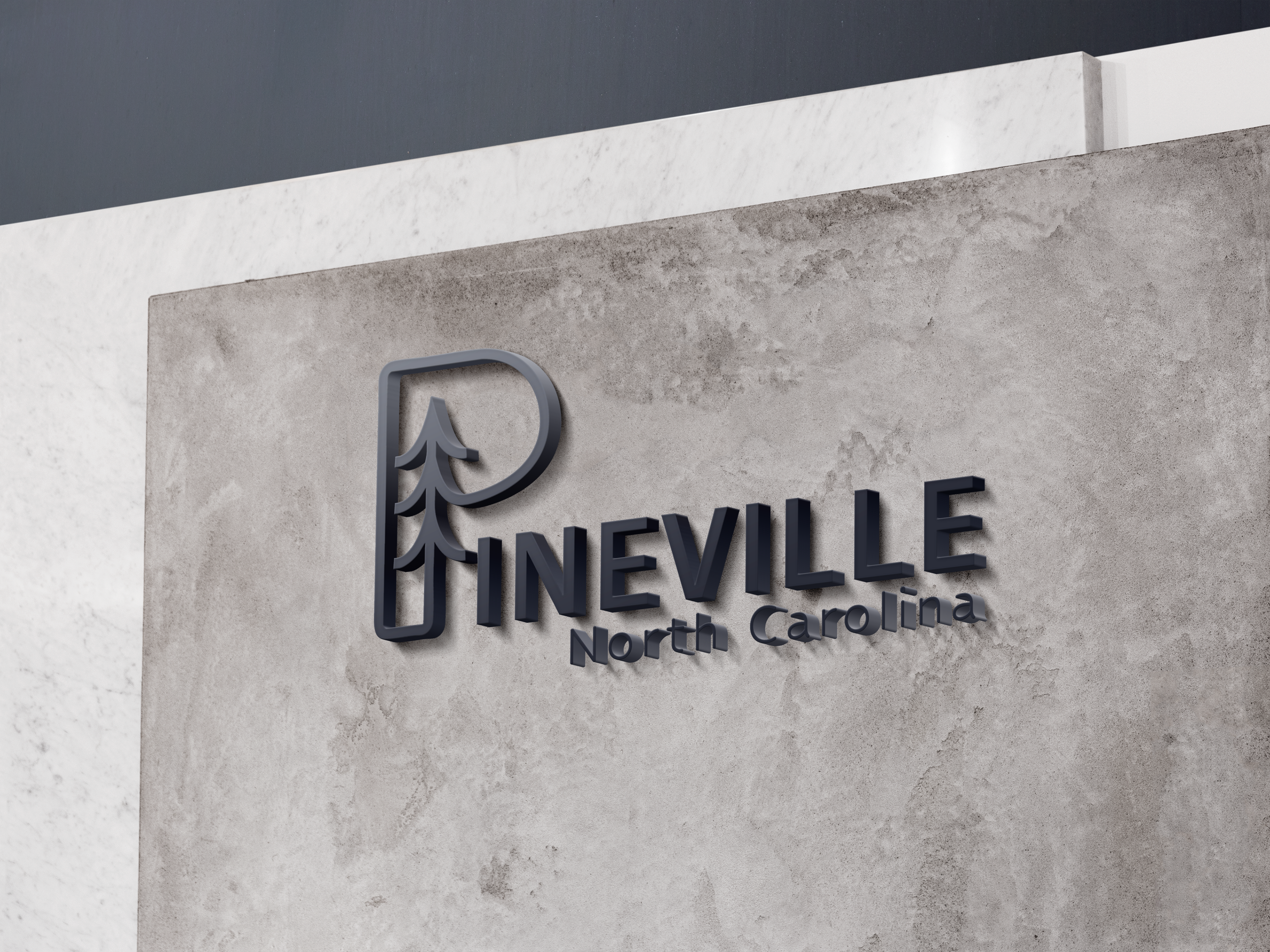
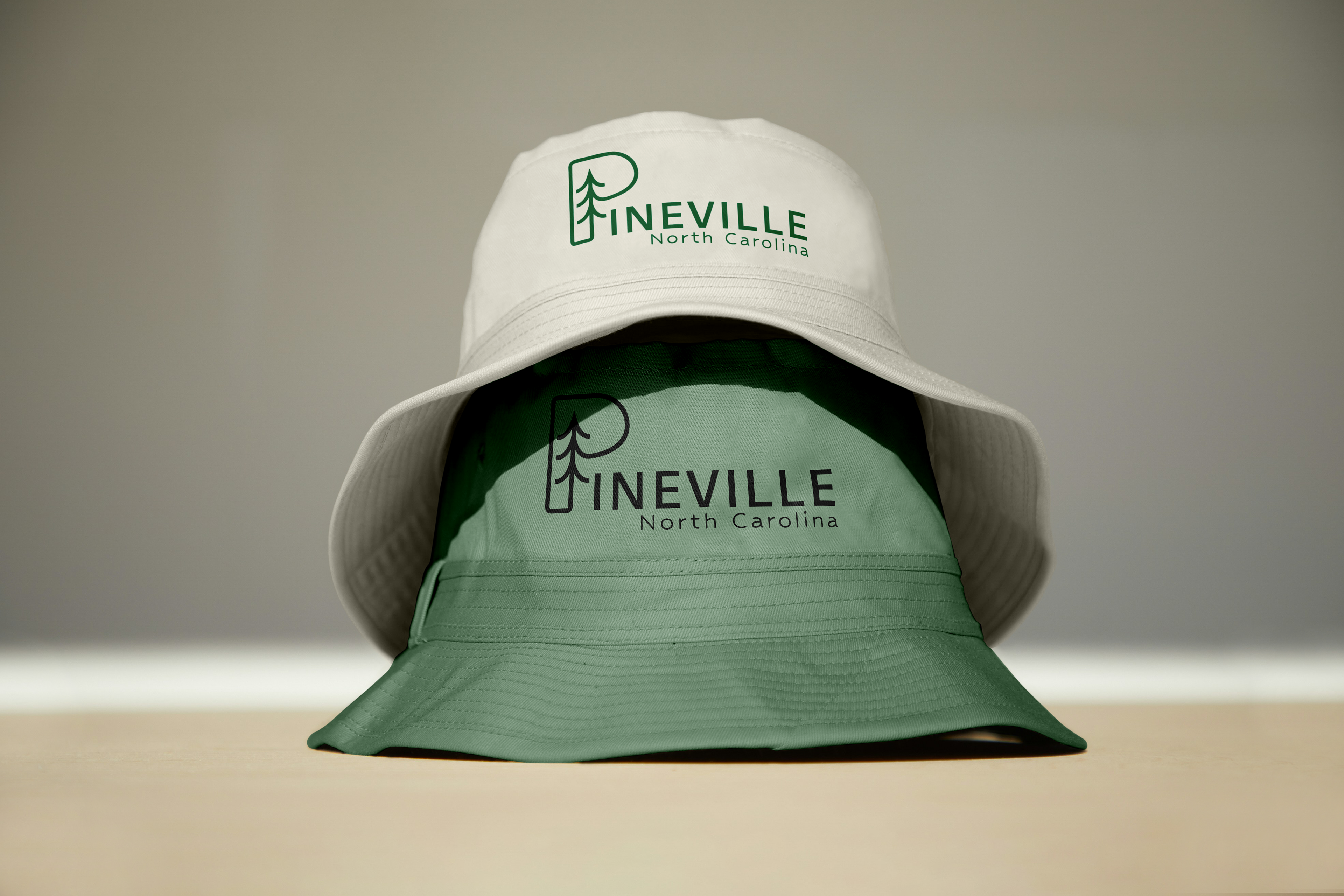
Revised Logo
Research:
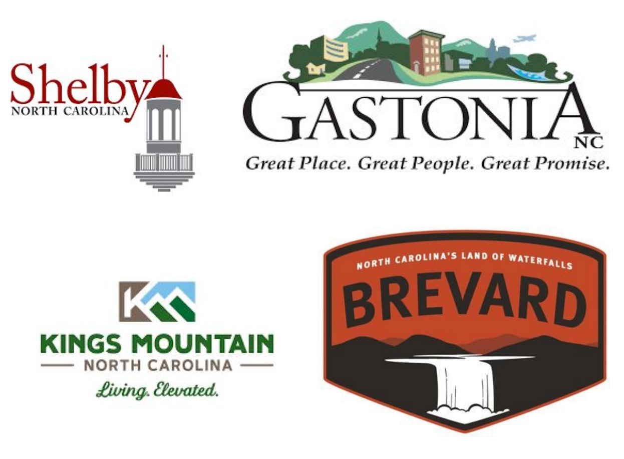
As someone from a small town, I recognize the importance of a logo that reflects the community’s identity while remaining visually appealing and memorable. In my research on small-town logos, I’ve noticed a common theme of incorporating local landmarks, history, and simplicity to create a strong sense of place. By studying various designs, I aim to find the perfect balance between modern aesthetics and the charm that makes small towns unique.
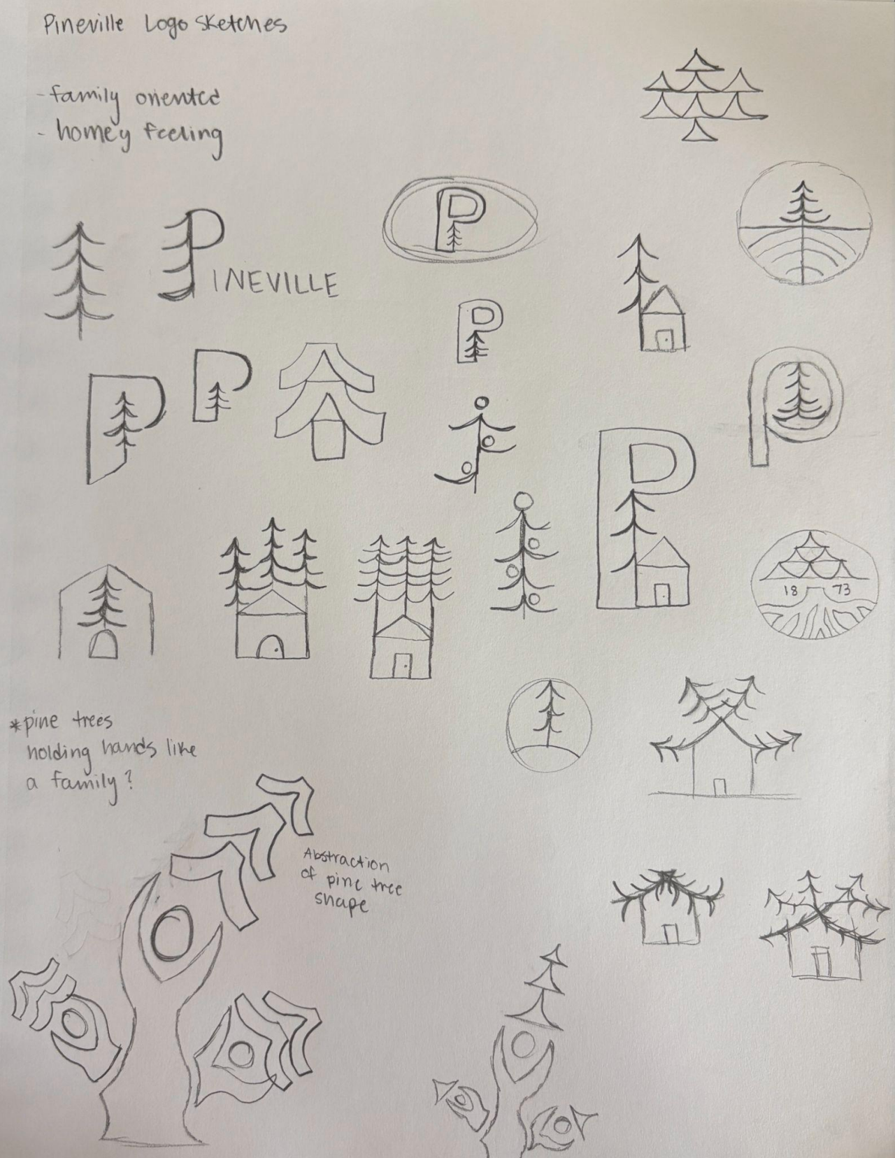
Ideation:
I wanted to preserve the tradition of pine trees while also incorporating themes of family and deep-rooted connections. Pineville is a close-knit, family-oriented town where generations often choose to stay. The town is rich with history, and its residents plant lasting “roots,” both figuratively and literally, making it a place of enduring community.
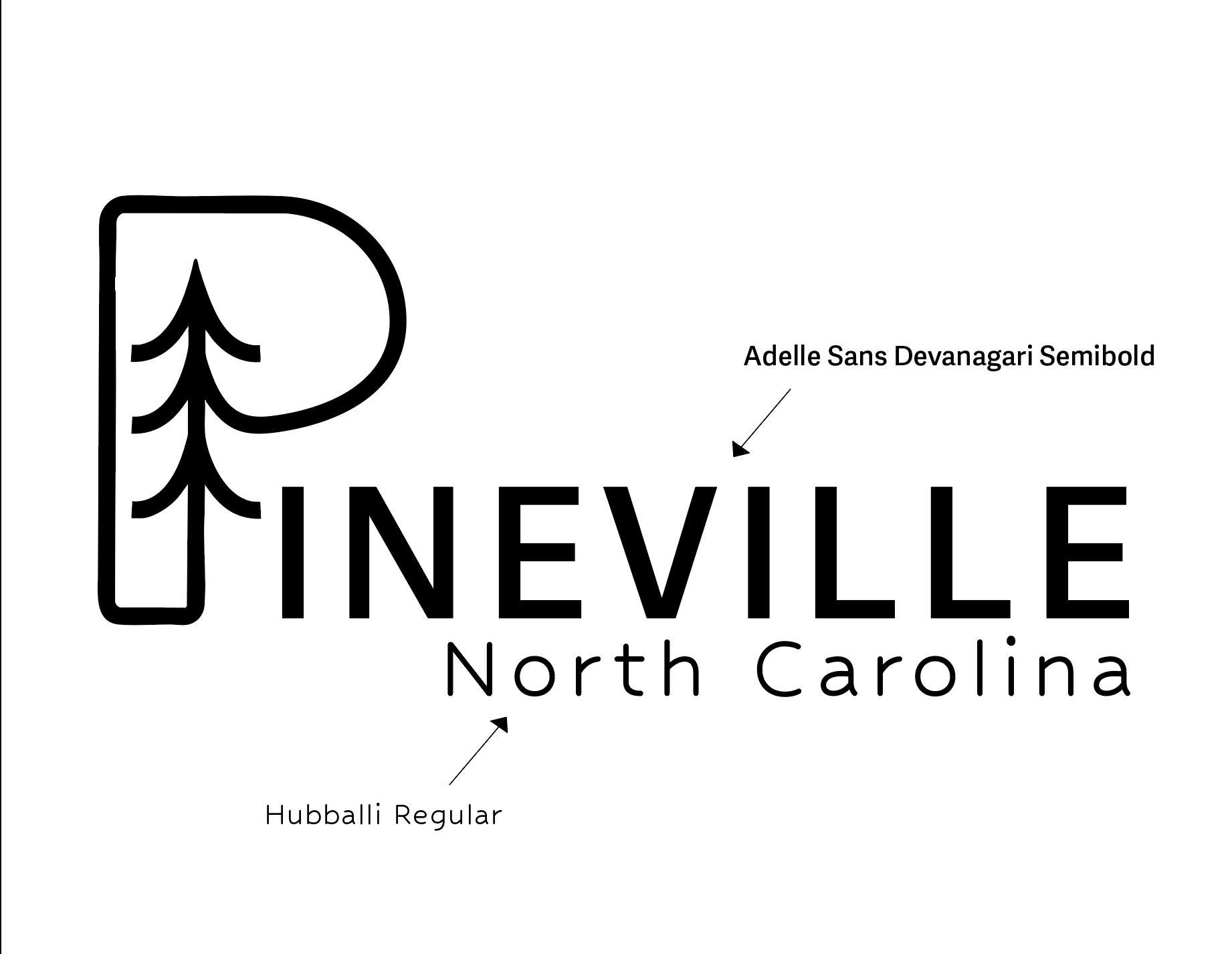
Final logo design with fonts included.
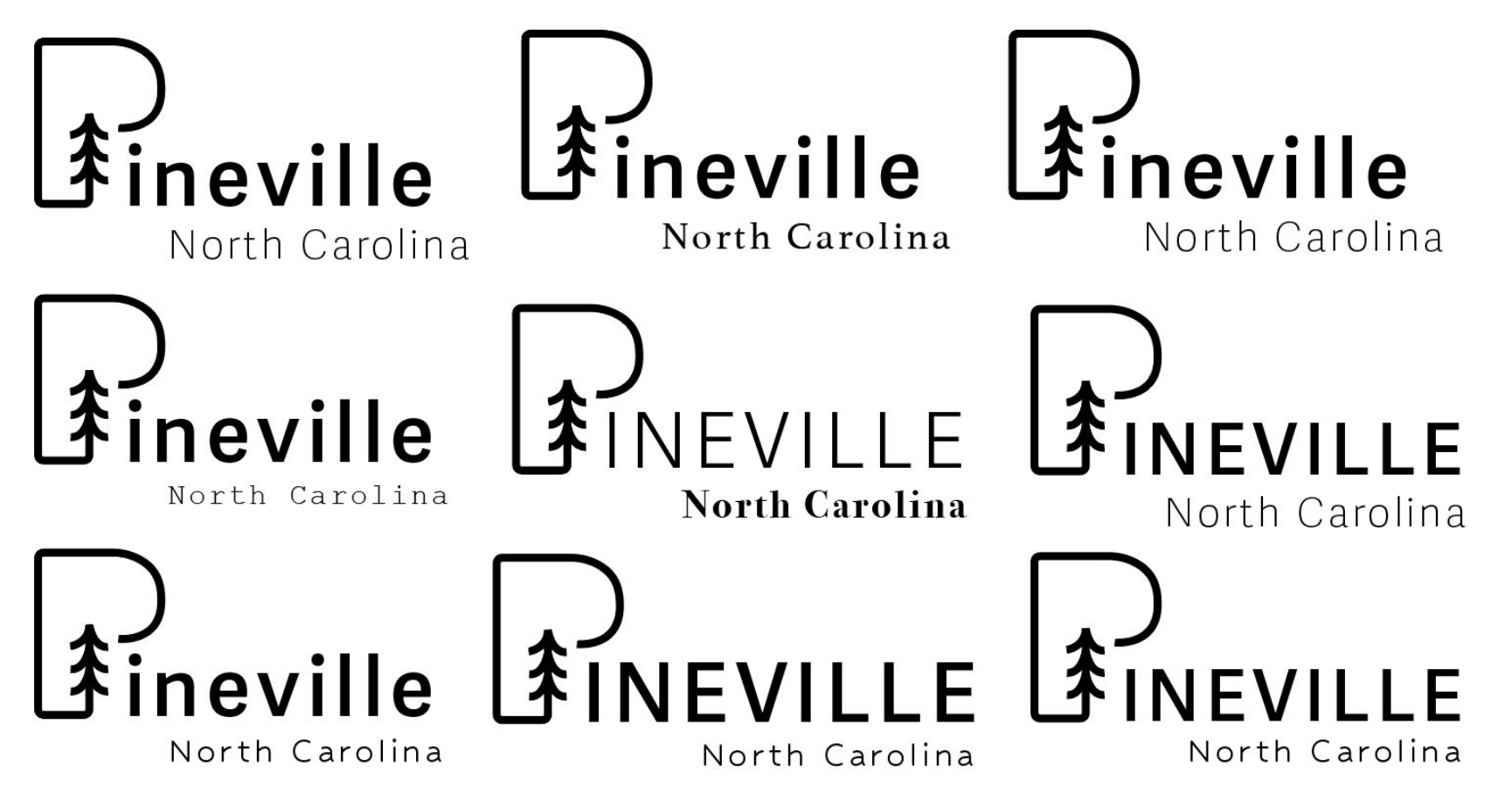
1st Iterations
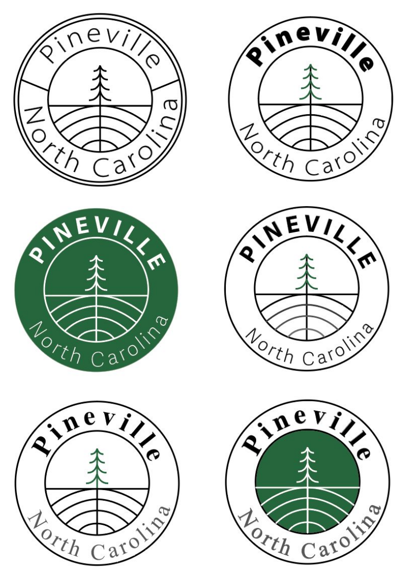
2nd Iterations