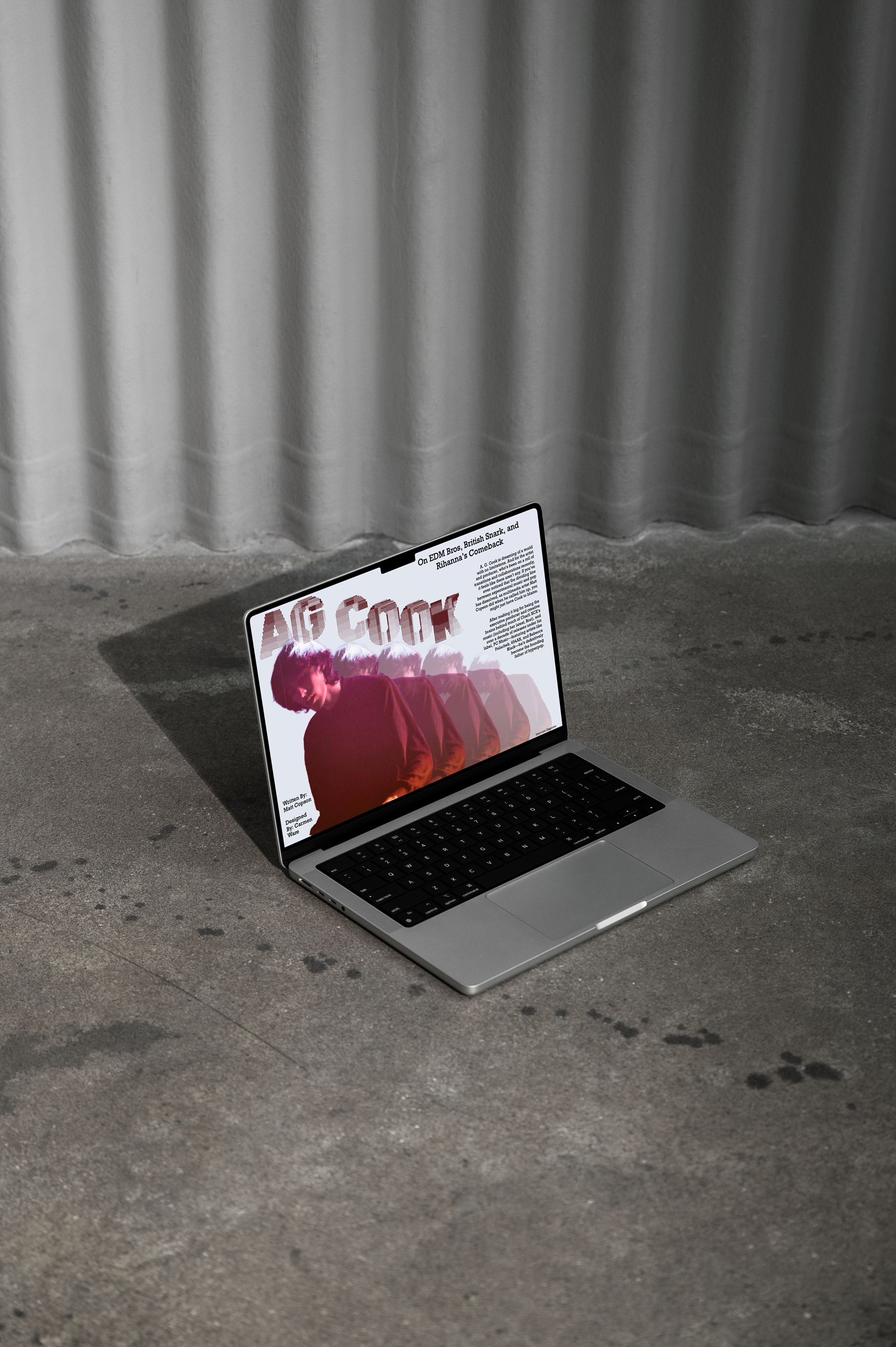
This magazine feature spread was inspired by A.G. Cook’s experimental hyper pop aesthetic. Layered repetition and halftone typography mirror the rhythm, movement, and lo-fi digital ethos of his music, while a clear hierarchy ensures readability. Designed for music magazine readers and pop culture fans, the spread reflects my interests in music and culture as well as my strengths in typography and balancing image with text. The piece achieves a strong conceptual tie between music and design.