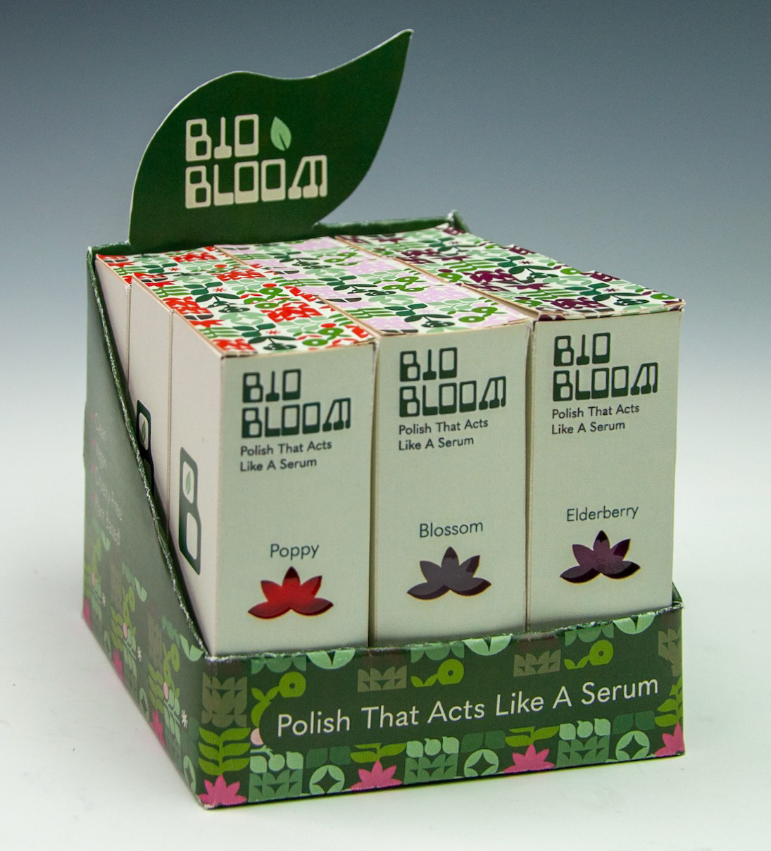
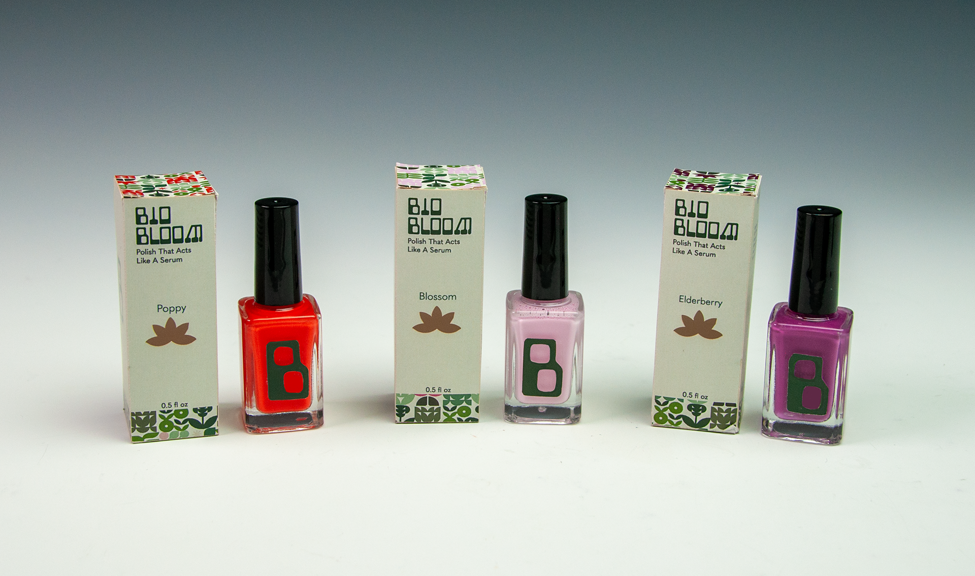
BioBloom is a concept packaging and retail display system for a hydrating nail polish designed to merge beauty with nail health. The product reimagines traditional polish as a treatment-forward cosmetic by incorporating plant-based ingredients that actively nourish nails during wear. The goal of this project was to design a container, tuck-box, and point-of-purchase display that communicates wellness, transparency, and premium quality while fitting real retail constraints.
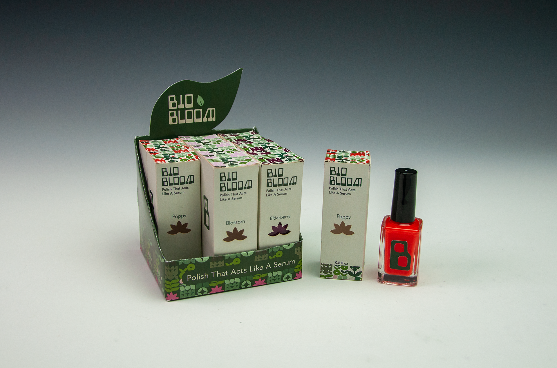
The final product holds a 0.5 fl oz (15 ml) glass bottle measuring 3.07” × 1.1” × 1.1”. The tuck-box was engineered to industry standards, built 0.035” larger than the bottle for proper fit and protection, resulting in final packaging dimensions of 3.14” × 1.17” × 1.17”. A compact POP display (3.58” width) was designed to hold multiple units while maximizing shelf visibility.
Problem:
Traditional nail polish often conflicts with the priorities of clean beauty consumers. Many formulas contain harsh chemicals that weaken nails, forcing users to choose between cosmetic color and nail health. Packaging in this category also frequently prioritizes aesthetics over sustainability messaging or ingredient transparency, which can alienate wellness-focused buyers.
From a structural standpoint, another challenge was designing packaging that protected a fragile glass bottle while remaining compact enough for high-density retail shelving and small footprint displays.
Process:
The design process began with structural problem-solving before visual branding. Measurements, material allowances, and retail spacing requirements were calculated first to ensure feasibility. From there, branding decisions were developed to align with the intended retail environments, including Sephora, Credo Beauty, Anthropologie, and Nordstrom.
Audience research guided visual direction. The target consumer is primarily women ages 25–45 who prioritize clean beauty, wellness, and ingredient transparency. This demographic tends to be research-driven, financially established, and highly attentive to product ethics and formulation. Visual language, therefore, emphasized refinement, clarity, and trust through minimalism and intentional typography.
Naming exploration focused on communicating care and biological wellness. “BioBloom” was selected because it suggests growth, vitality, and natural nourishment while remaining elegant and memorable. Supporting brand language centered on words such as accountable, restorative, transparent, and thoughtful to reinforce credibility.
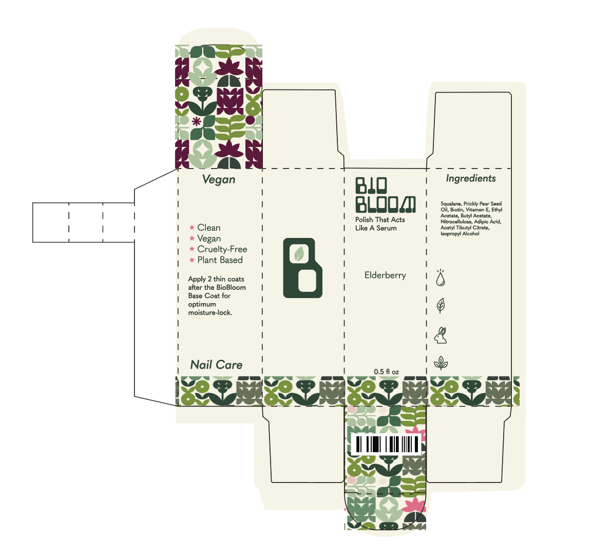
Tuck Box Die-Lines
Solution:
The concept solution positions the product as “skincare for your manicure.” Instead of treating polish purely as decoration, BioBloom reframes it as a treatment product that happens to include color. The formula highlight, plant-based squalane, is emphasized as a functional ingredient that locks moisture into the nail plate and supports growth.
Packaging dimensions were engineered to industry-standard tolerances, ensuring manufacturability and safe containment. The POP display was designed to sit in high-traffic retail zones such as skincare aisles, end-caps, and wellness tables, allowing it to benefit from existing consumer interest in self-care products.
Visually, the system balances vibrancy with restraint. Color conveys creativity and beauty, while a structured layout and typography convey scientific credibility and transparency. This duality mirrors the product’s promise: cosmetic enjoyment without health compromise.
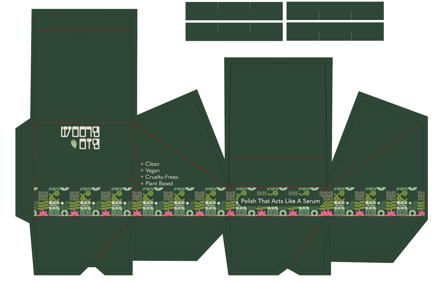
POP Display Die-Lines
Takeaways:
This project reinforced the importance of designing from the inside out. Structural accuracy and retail context must be solved before aesthetics can succeed. It also demonstrated how branding becomes strongest when it is anchored in a clear product truth rather than surface-level styling.
Most importantly, the work highlighted how packaging can act as education. When form, messaging, and placement all align with consumer values, design does more than attract attention. It builds trust, tells a story, and positions a product as a solution rather than just another option on the shelf.