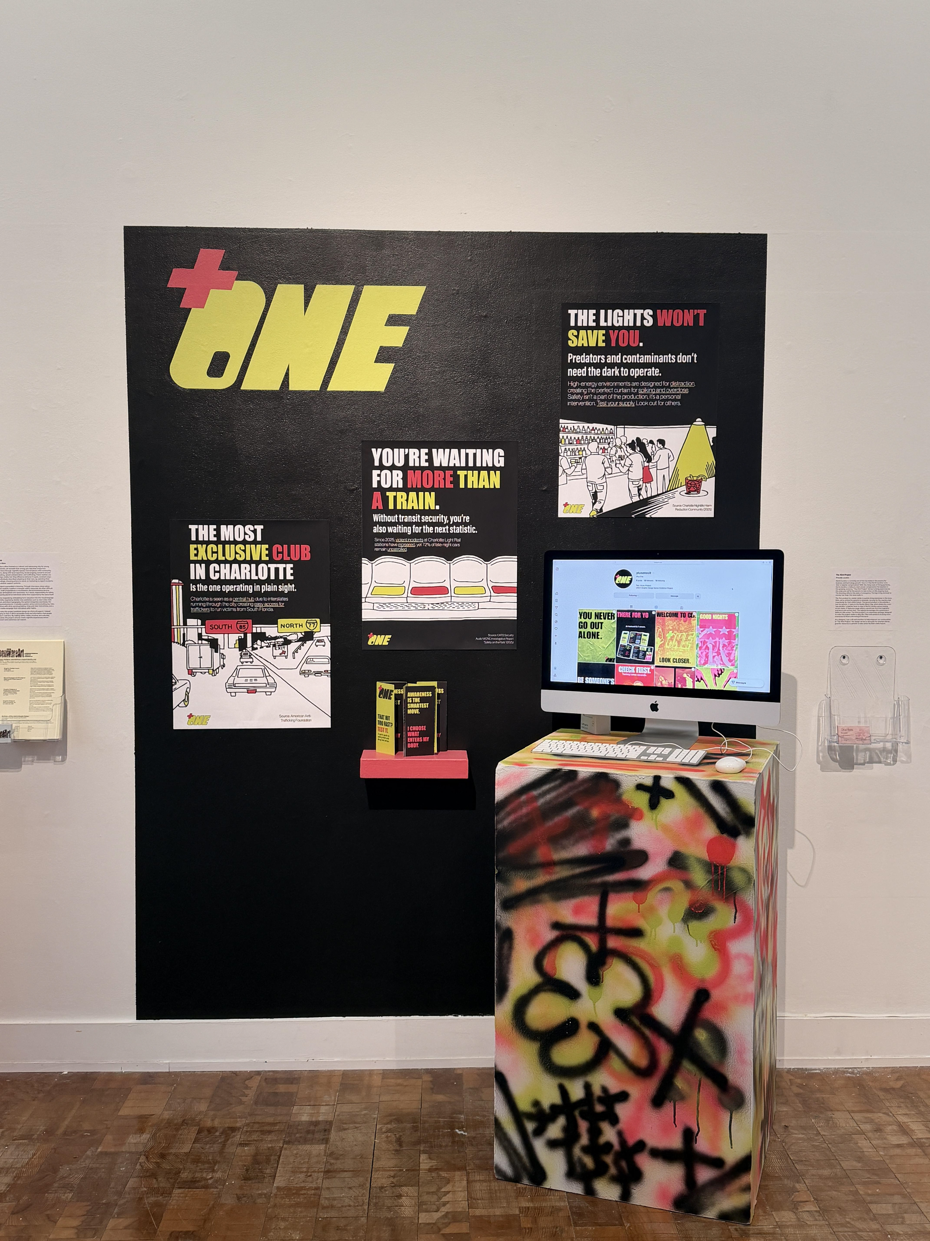
For my BFA Senior Thesis, we were tasked to pick an issue affecting a local Charlotte community and design a brand that can solve that issue through the design of three products. Plus One is a harm-reduction campaign designed to improve access to safety information within Charlotte’s nightlife environment. Through posters, printed materials, and social media content, the project integrates accessible safety resources into spaces where risks such as drink spiking, opioid contamination, and human trafficking are often overlooked.
Problem:
Through interviews and local research, I found recurring concerns around drink spiking, drug contamination, and human trafficking. Many people described going out as a balance between enjoying the night and quietly managing risk.
For example, about 1 in 13 college students report having their drink spiked, and in North Carolina, fentanyl now drives most overdose deaths. At the same time, Charlotte’s location along major interstates contributes to its role as a trafficking hub.
Many nightlife environments prioritize atmosphere over awareness, making safety resources difficult to find or absent. Patrons often adapt their behavior quietly to manage risk, highlighting the need for visible, intuitive harm-reduction systems.
Process:
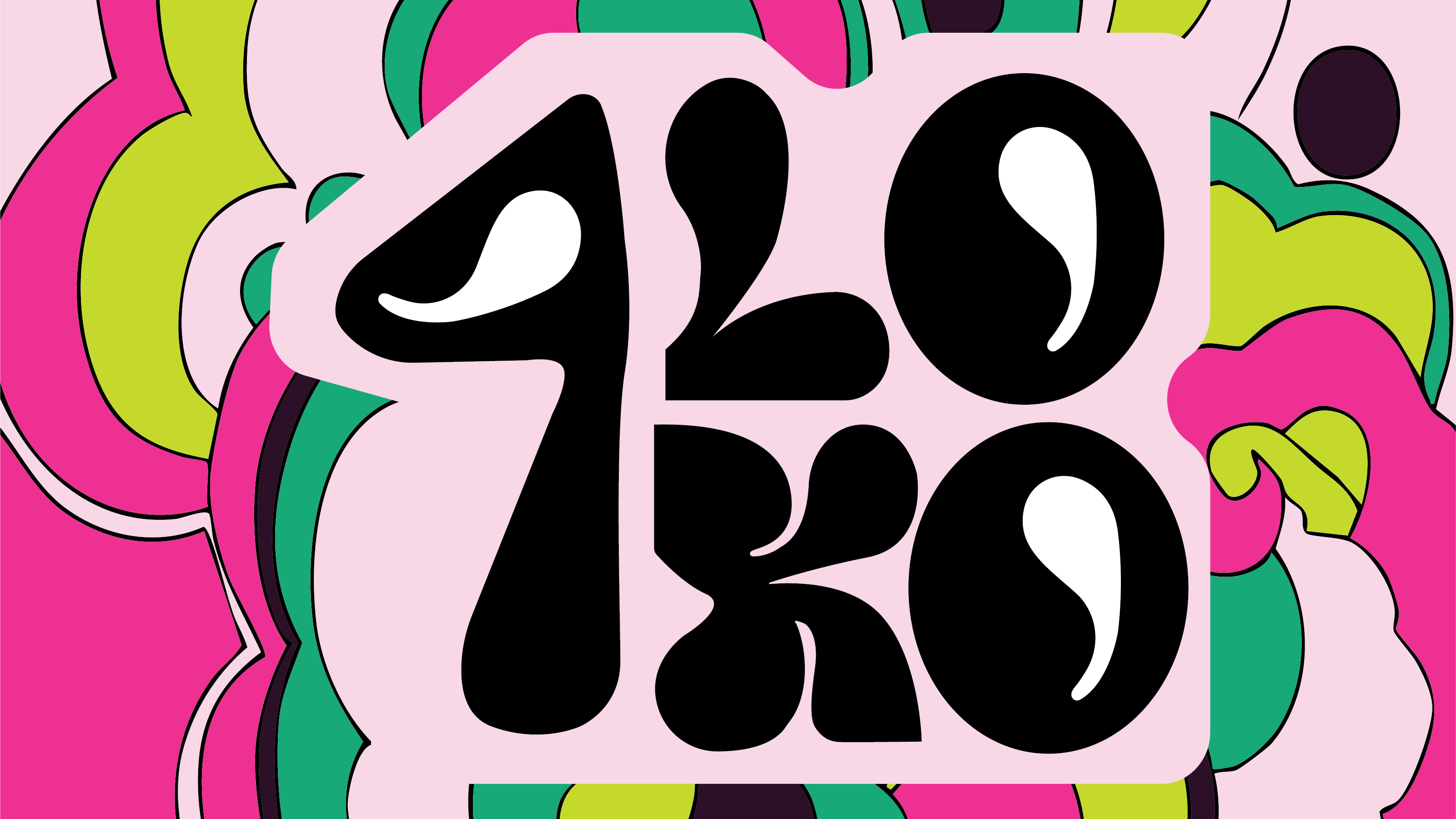
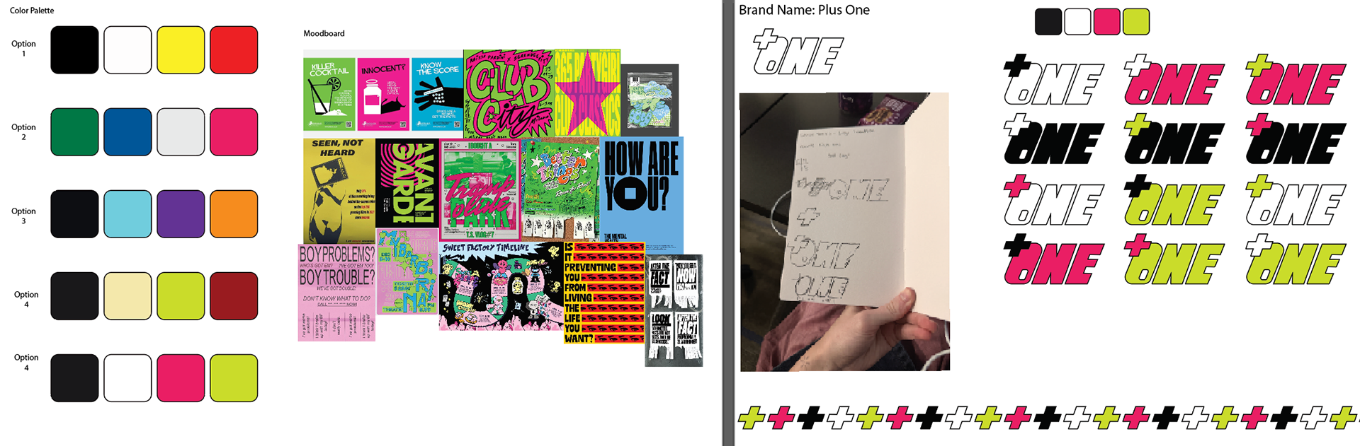
The visual identity for Plus One was shaped through research into nightlife culture, underground poster design, and public-awareness campaigns. The mood board combines references from club flyers, street graphics, protest typography, and safety messaging to create a system that feels energetic, urgent, and culturally familiar. High-contrast typography, layered compositions, and neon-inspired colors reflect the sensory environment of nightlife spaces, where information must compete with movement, noise, and visual stimulation. Rather than appearing institutional or instructional, the goal was to develop visuals that feel native to bars, clubs, and social environments so safety messaging can exist naturally within those spaces.
Color exploration focused on balancing nightlife aesthetics with functional communication. The final palette of black, white, hot pink, and lime green draws inspiration from fluorescent signage, club lighting, and cautionary visual language, creating strong contrast and immediate visibility.
Logo development centered around the idea of companionship and protection, with the name Plus One referencing the presence of support within nightlife environments. Italicized typography and bold outlines create movement and adaptability across posters, printed materials, and digital content. Together, these visual choices position the identity as approachable, recognizable, and integrated into the culture it is designed to support.
Research and Interviews:
Research and interviews played a major role in shaping this project. Because harm reduction in nightlife is closely tied to personal experience, understanding the topic required more than statistics alone. Conversations with patrons, transit riders, and advocates revealed common themes, including difficulty finding safety resources, uncertainty about what to do in emergencies, and reliance on personal strategies to navigate risk. These firsthand perspectives helped ground the project in real experiences rather than assumptions.
Secondary research supported these insights by connecting individual stories to larger issues surrounding drink spiking, opioid contamination, and trafficking within nightlife spaces. Together, research and interviews informed both the visual direction and overall strategy, ensuring the project was built through listening and designed to respond to real needs.
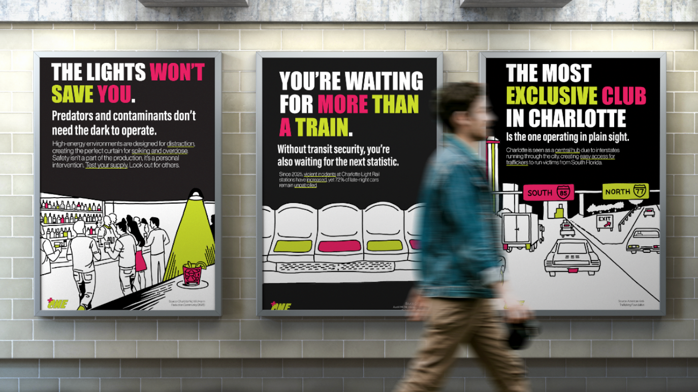
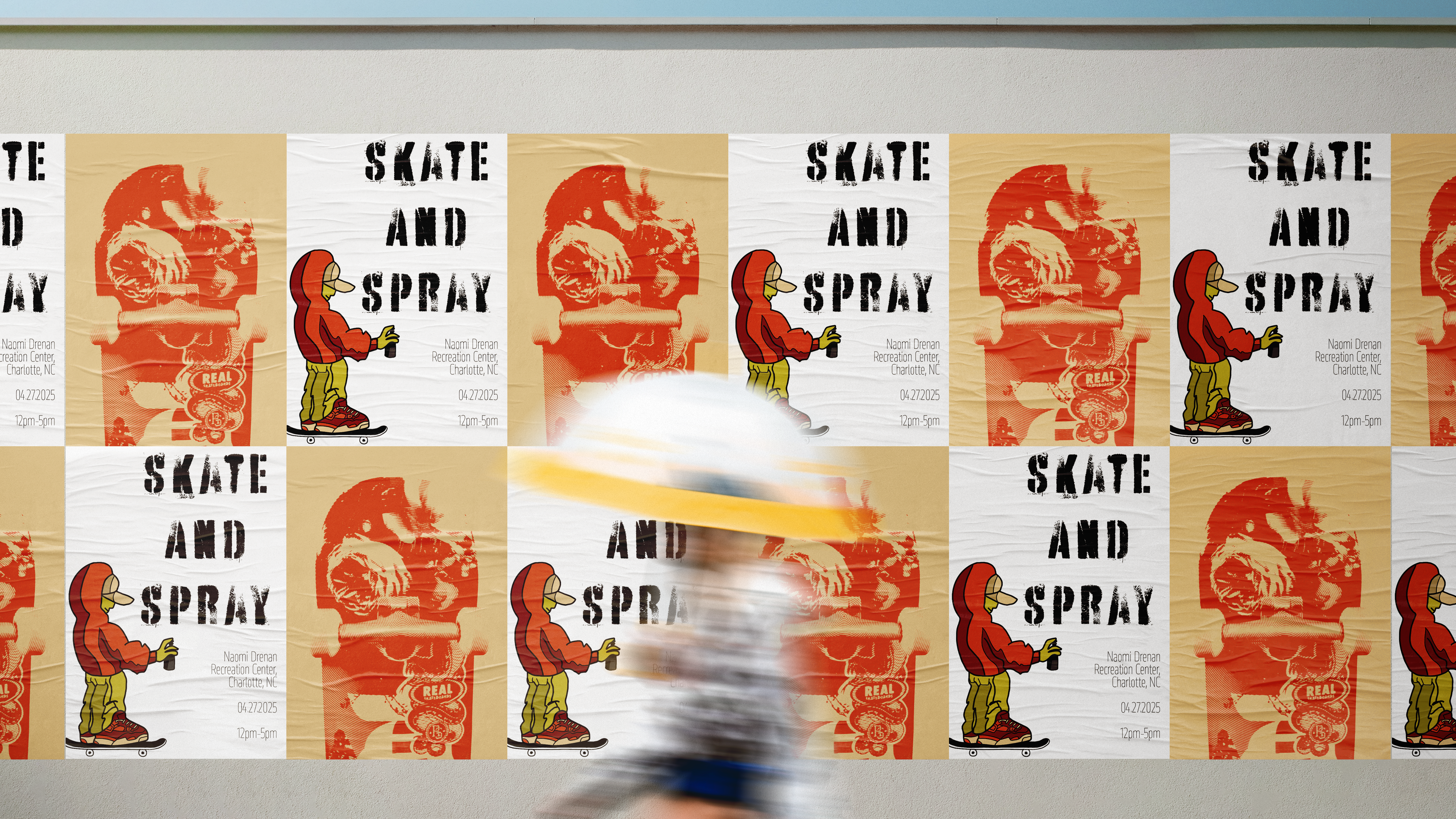
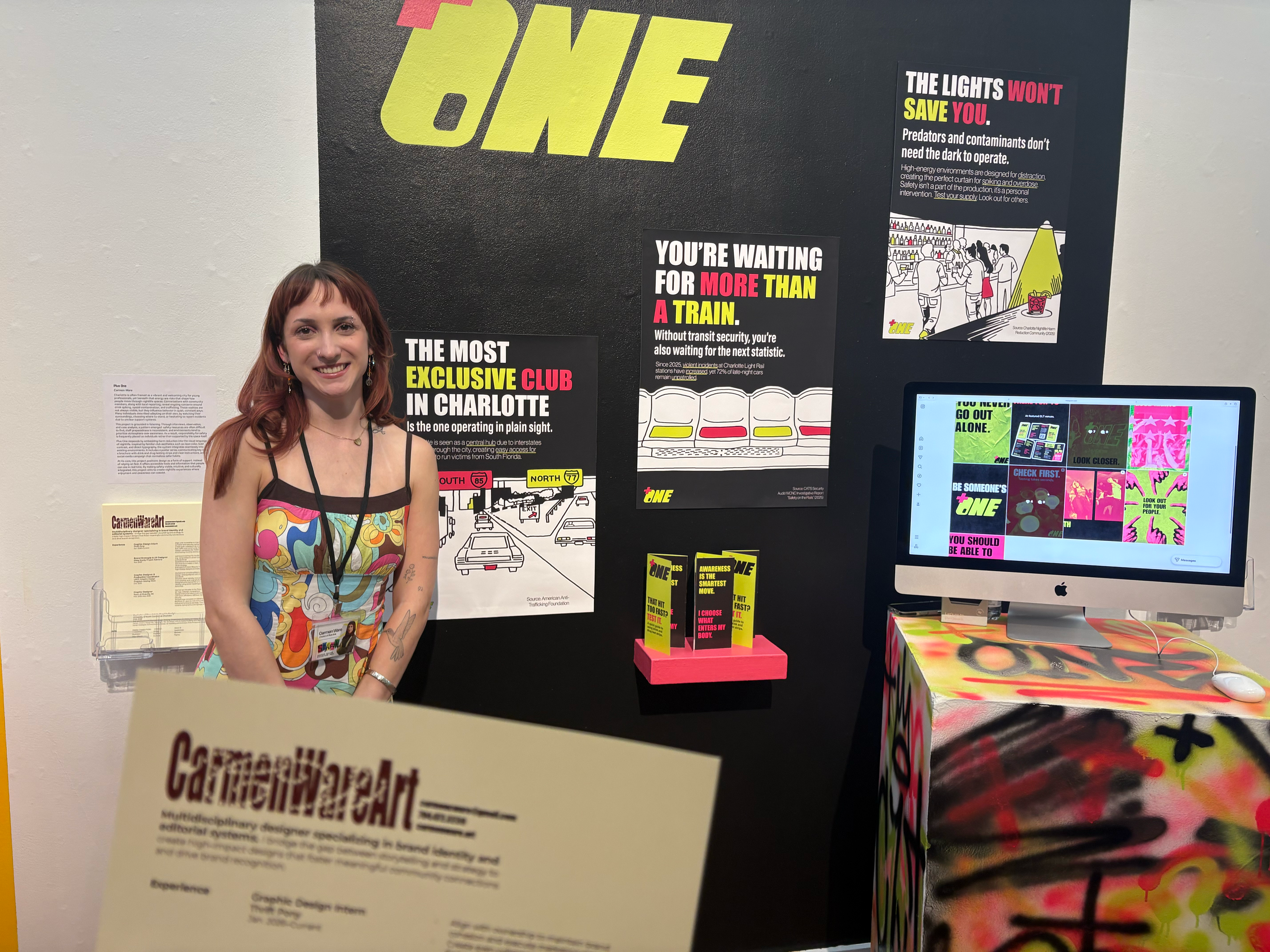
Product 1: Poster Series
The first product is a poster series placed in transit areas like train and bus stops.
These posters use bold headlines and statistics to interrupt routine moments and raise awareness before people even arrive at a venue.
These posters use bold headlines and statistics to interrupt routine moments and raise awareness before people even arrive at a venue.
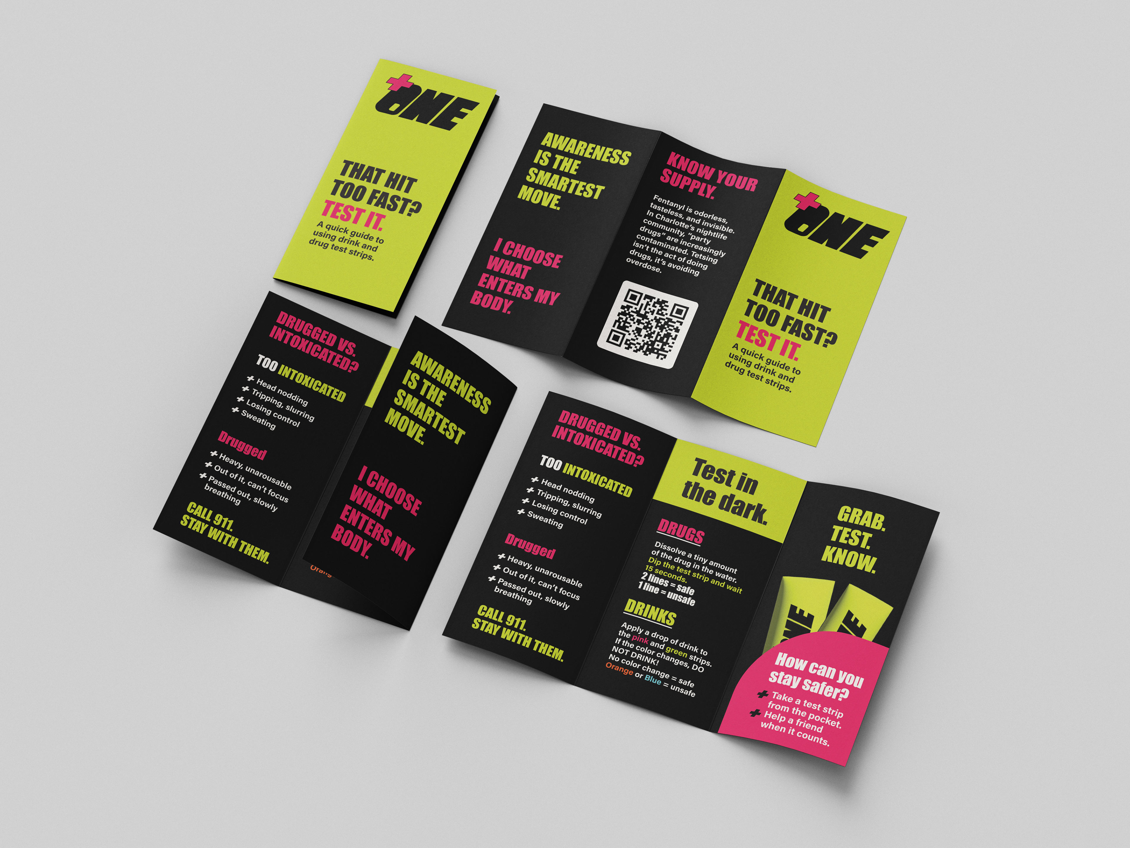
Product 2: Brochure
The second is a brochure designed for bar and club bathrooms. It includes drink and drug testing strips, along with simple instructions and information about why testing matters. The typography is also easy to read and understand in dim lighting. This creates a moment where someone can pause, check in, and take action if needed.
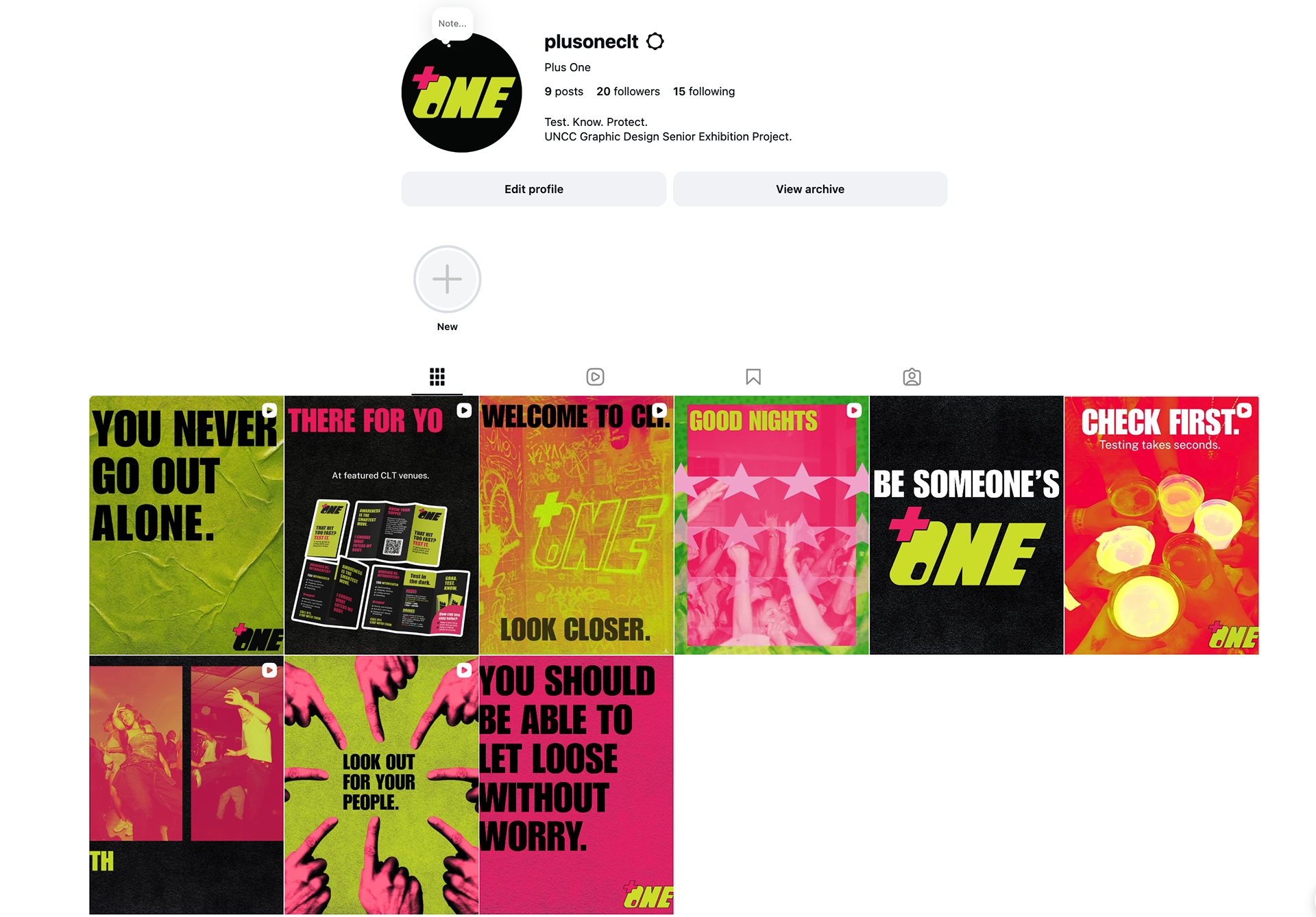
Product 3: Social Media Campaign
The third is a social media campaign that extends the message beyond physical spaces.
It promotes safer habits, normalizes testing, and reinforces the idea of looking out for your “plus one”, the people around you.
It promotes safer habits, normalizes testing, and reinforces the idea of looking out for your “plus one”, the people around you.
Takeaways:
Together, these pieces work as a system, before, during, and after a night out.
At its core, this project is about shifting responsibility. Not placing it entirely on individuals, but supporting them with the tools and information they need.
Because safety shouldn’t be something you have to figure out alone. It should be built into the environment quietly, consistently, and intentionally.